Jamie as a designer in front of a whiteboard with the caption 'let's create excellent journeys together'

Let's talk design.

I'm proud to lead the digital design experience for the Shawbrook marketing team, where I've been since 2021.

If you think we should work together, I'm always open to opportunity.

This page is a snapshot of how I approach work and some examples of what I've done.

Philosophy

When it comes down to it, there are three key principles I work by.

Simple beats fancy.

Making something easy to understand isn't easy, but it's worth it.

Red-herring gimmicks or arrogant 'if you know, you know' design have no place within human-centred design.

At it's best, innovation leads to simplicity, and removes barriers of technical, cognitive or cultural understanding.

Test your thinking.

The customer should be at the heart of design. How they will react, how they will understand, how they will use the tools you set before them.

This cannot be achieved in an echo chamber.

Making and testing hypotheses is essential to my design process. Whether they are proved right or wrong, it's still a positive outcome.

Bring others on the ride.

Make it as easy as possible for others to experience your design.
Make a prototype to show interactions, even if it's just a sketch.
Find a platform that works for your audience.

Engaging early and often with stakeholders removes uncertainty and turns a 'big reveal' signoff into something you've crafted together.

My Process

I approach just about every project with the same seven steps. They're not complicated, but they work.

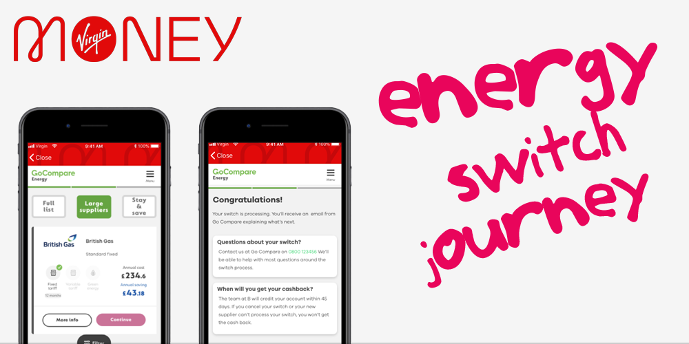
This starts with customer research, market scanning and a deep understanding of how (and why) things as they are now. I map our journey. I identify the pain points.

I confront the bits that we don't like to talk about and get comfortable feeling uncomfortable.

Regardless of how they do it now, customers are creatures of inertia. They are moved to act by the job they want to do.

I find out what the jobs to be done are and use them as the cornerstone of design.

I explore key moments in the journey, and evaluate where they are now, grading from 'dysfunctional', through to 'functional' and on to 'magical'.

I aim to concentrate my efforts on first ensuring the whole journey is at least 'functional', reserving 'magic' for (a few) critical moments.

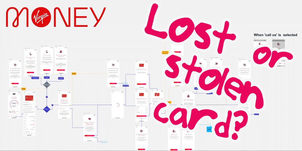
When looking at solutions, I create rapid prototypes early and often.

'Enough' is determined by the audience. Sometimes it's a quick wireframe to illustrate a process, sometimes a high fidelity prototype.

I create hypotheses and test them. Moderated, unmoderated and quantitative research all have their place here, but a key part of the process is speed, allowing iteration.

By stating my assumptions and testing them, I avoid unconscious bias and keep the customer at the heart.

Everything is disposable, and sometimes, your darlings must die. Whether proved correct or incorrect, testing allows me to return to the idea and make it the best it can be.

I repeat steps five and six until I have something viable.

It's easy for best intentions to be lost in translation. I strive to be flexible with handoff, working with developers to remove guesswork.

I follow this with rigorous testing to ensure that the vision we agreed in the design phase follows through to the final article.

Projects

I've been involved in a broad range of projects over the years.

When we talk, I'd love to share my portfolio with you that goes into each example in more detail. For now, here's a snapshot of the work I've done.

...
Energy switching … In your banking app?

Our customers were pretty savvy. But we identified most of them were paying over the odds for energy.

So we created a compliant energy switch process in partnership with a third party, right in the everyday Virgin Money banking app.

...
Helping you freeze your card

We've all misplaced a bank card at some point. Working within strict security and regulatory guidelines, I created a robust card freeze / replace journey.

It saved time, reduced cost and stopped customers cancelling their card, only to find it 30 minutes later.

...
Making product tables beautiful

Financial product tables are tricky. Mostly, the mobile view suffers. Or the desktop view does. Rather than wrestle with the differences, I embraced them, to create tailored views designed for the device you're on.

All with a shared back end for easy updating.

...
Going paperless

Over half a million customers were still receiving paper statements. I lead a Google-style Sprint with a team of experts to explore why customers didn't want to move to digital, and create a solution that solved for that.

Sure, we saved a million in three months and increased adoption.

But I'm most proud that we built care for the most vulnerable into the solution, vastly improving experience for them from mail.

...
Rebranding the Shawbrook site

Ok, maybe a bit more than a rebrand.

We took a site controlled by a complex CMS, rebranded it, built a design library and ensured the CMS functionality was easy to democratise among non-specialists.

We gave them lego bricks to safely build consistently great pages.

While we had the bonnet up, I stripped down the user journeys for every section and persona we expect on the site. We've seen the results that justify the work.

...
Kind of the same thing - broker sites

We built a beautiful website for direct customers. Then we were asked to do the same thing but with a 'log in' button for broker partners.

Instead I went right back to the 'why'. We refactored the expected journeys and built an equally great website - the same, but different.

The end result is a targetted broker site that's seen qualified leads rise because it's able to focus less on product and more on the long term relationship. Just like it's meant to.

Get in touch

It should probably go without saying... but I won't share your email with anyone.