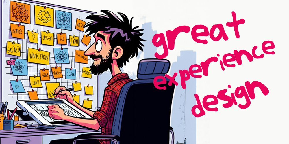
Let's talk design.
I forge UX, product thinking and storytelling into journeys that cut through in the complex world of financial services. I take ideas from sticky notes to deliverable services that work for the customer, the business and the team delivering them.
I currently lead digital experience design in Shawbrook’s marketing team (since 2021).
Before joining Shawbrook, I was a senior designer at Virgin Money, and earlier held product and customer focussed roles at Santander and RBS.
My Approach
Design isn't decoration. It's decision making.
I start with understanding: the problem, the systems and the people that use them. Then I move through hypothesis, prototype, test and validation, cutting noise and iterating fast.
There are three princicples at the heart of what I do.
Simple beats fancy.
Making something easy to understand isn't easy, but it's worth it.
I strip out red-herring gimmicks and keep humans at the centre of things.
Innovation should remove barriers of technical, cognitive and cultural understanding to create great experiences for all.
Test your thinking.
The customer should be at the heart of design. We need to know what they see and how they see it. How they decide and act. Then we design around the jobs they need to get done.
This cannot be achieved in an echo chamber. Making and testing hypotheses with small batches of customers is essential to the design process.
Bring others on the ride.
No designer is a lone wolf. It needs to be as easy as possible for others to follow your process, your reasoning and your design.
Engaging early and often with stakeholders removes uncertainty and turns a 'big reveal' into something you've crafted together. Problems are caught sooner. Alternate points of view are considered and tested. Sign-off is aligned.
Selected Work
At Shawbrook, we're a small, highly capable team, so I wear a lot of hats.
As Experience Design Lead, I'm responsible for UX & UI, component design, the CMS authoring experience, QA and accessibility. I work across Figma, Umbraco, Adobe, Miro, Jira and Confluence - whatever it takes to move ideas from concepts to delivery.
Pages to pieces
Rebuilding Shawbrook with a modular design system
What's your Lego? Mine is a modular system of Umbraco components.
Building the site like Lego replaced rigid templates with a flexible component system. It let teams assemble pages quickly, adapt layouts without development, and keep quality consistent even as the site scaled.
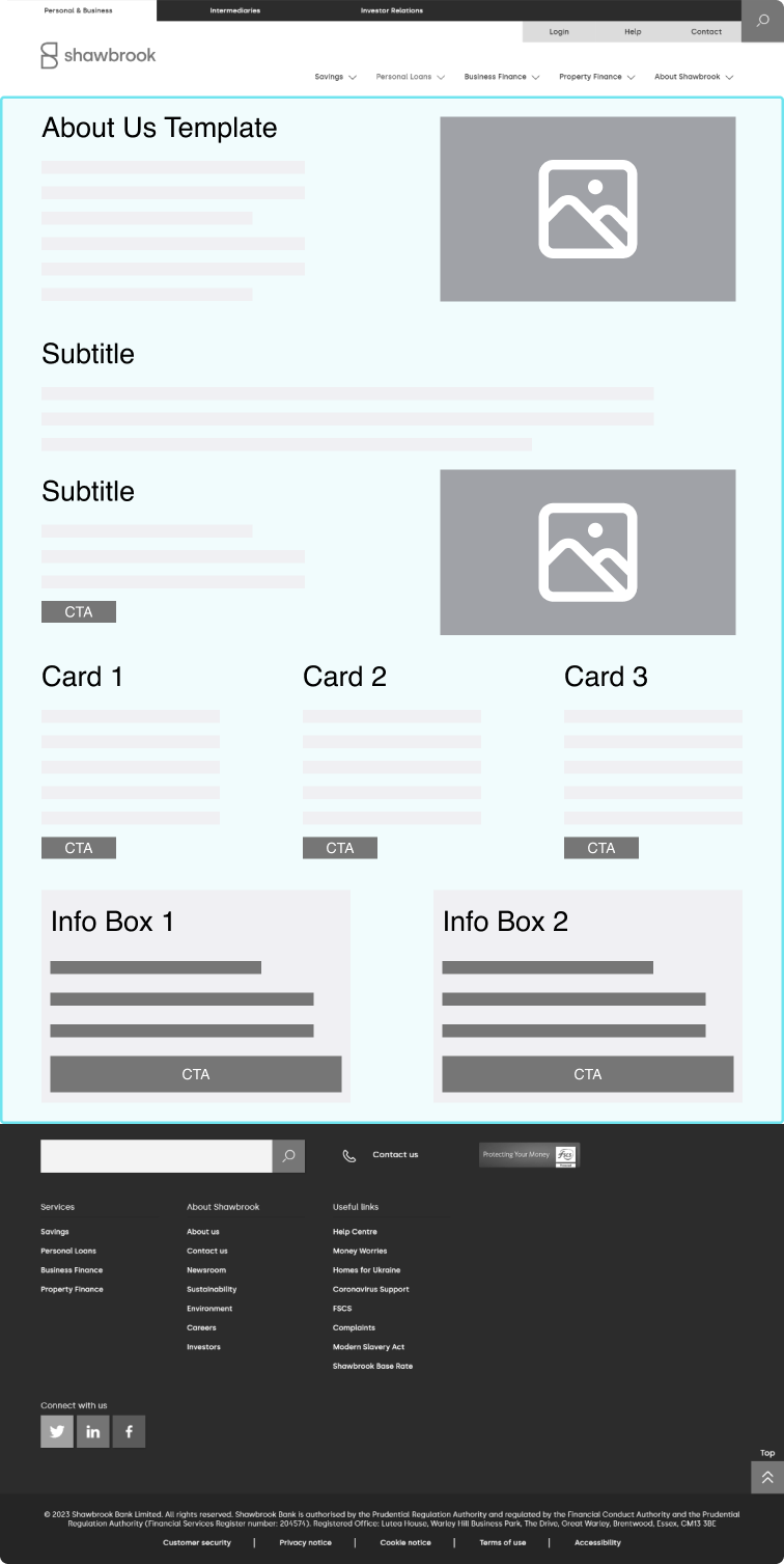
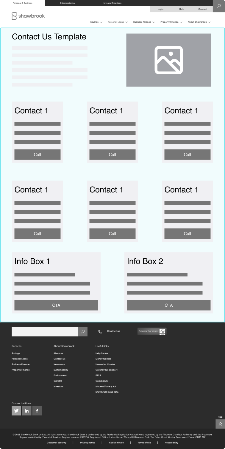
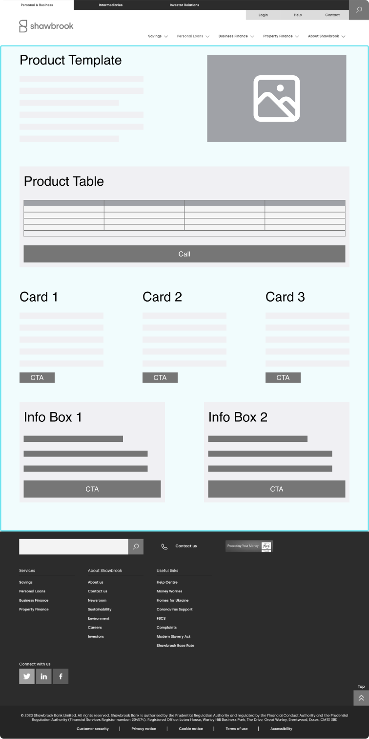
Before the rebuild, the site was locked into fixed page templates. Content teams could update copy and images, but adding new elements required development time.
Before the rebuild, the site was locked into fixed page templates. Content teams could update copy and images, but adding new elements required development time.
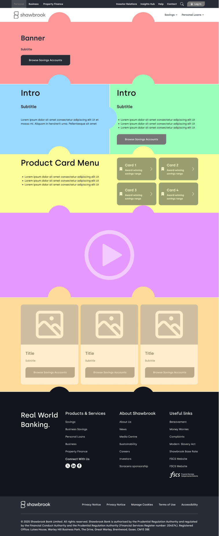
Switching to a component library that worked like Lego allowed us to build flexible templates that adapted to changing business requirements.
The new modular component library changed that. By treating pages like Lego, we created flexible templates that could adapt quickly to new business needs.
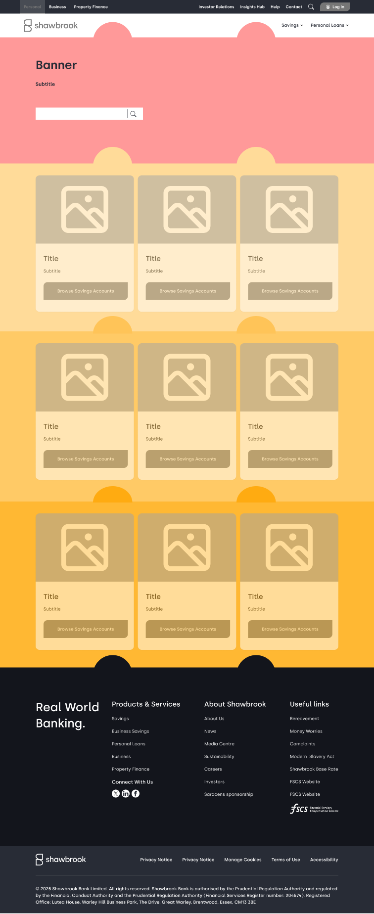
Micro sites, macro speed
The rapid-launch microsite playbook
We don't do 'one and done'. We do 'solid and repeatable'.
We built a repeatable microsite playbook using shared navigation, reusable templates and subtle CSS variations. This allowed us to launch new microsites in a fraction of the time, all while keeping them consistent with the main site.
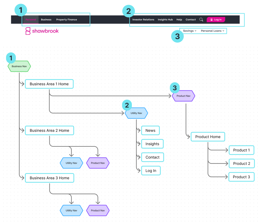
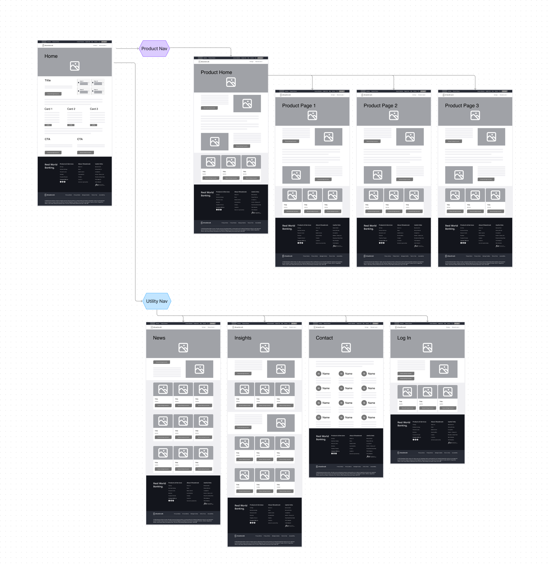
Designing a navigation system that worked across every foreseeable microsite was key. Starting with the business area (1) as the primary variable let us add a utility nav (2) and a product nav (3) that could shift contextually. This became the backbone of both the main site and every microsite template.
Microsites shared a common page structure, with subtle visual differences handled in CSS. Reusable templates gave us consistent bones across the estate, while small style and imagery changes made each microsite feel aligned but distinct.
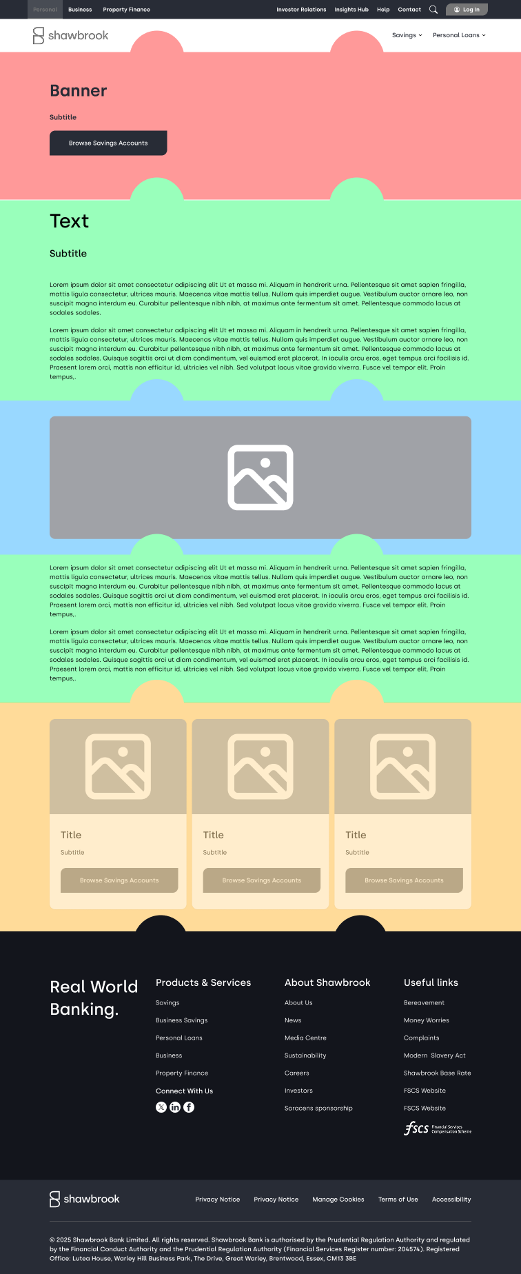
The art of the impossible
Using smart CSS to make one component into two (or three)
Sometimes the quickest way forward isn't a rebuild. It's a rethink.
By stretching what was possible with the CMS, we created multi-purpose components from single base elements — award tiles, HTML containers and adaptive banners — all without developer support. This let us design, iterate and deploy custom solutions in days instead of weeks.
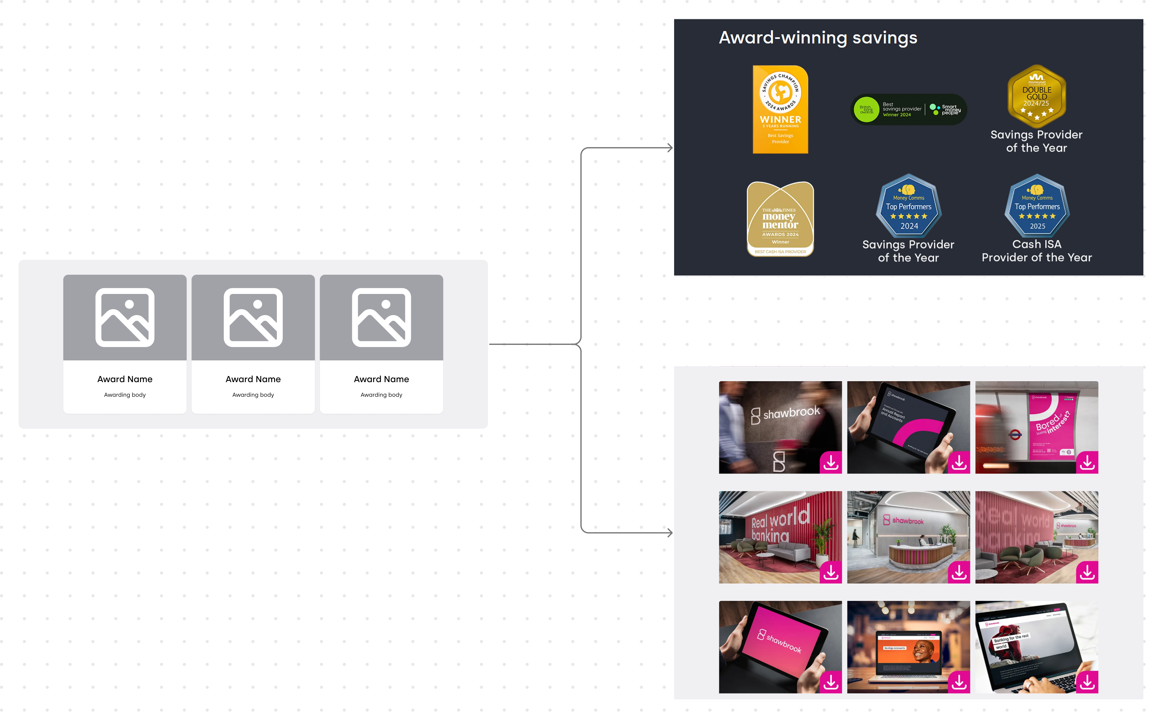
The awards component improved SEO by linking both the award image and the awarding body. We also added space for the award name and awarding body name as additional clickable links.
When building the media library, we reused this component to generate clickable thumbnails that opened higher-resolution images.
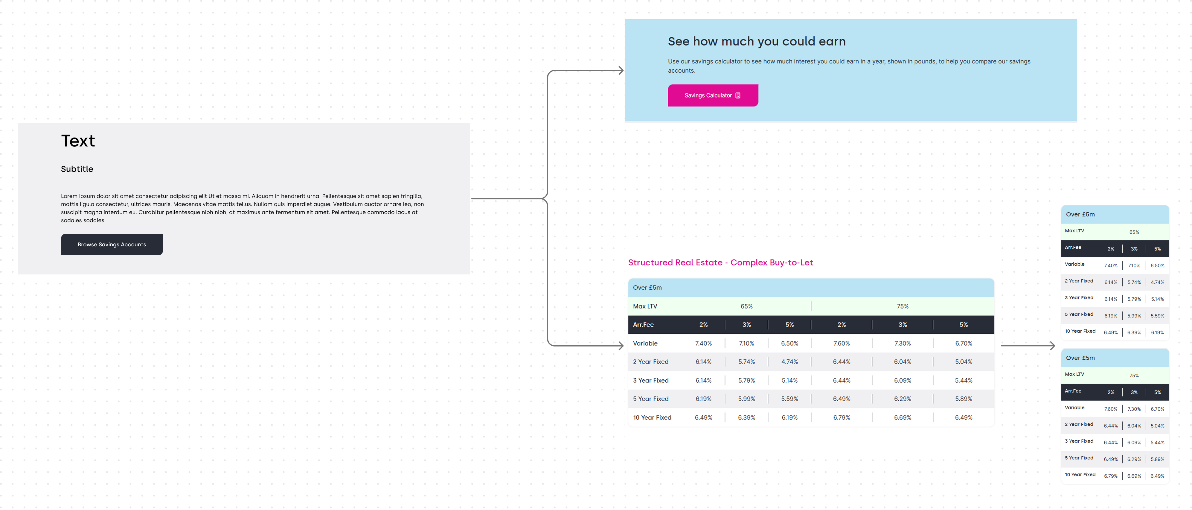
A standard text box became a container for custom HTML thanks to the CMS’s rich-text area. Most styling came from the core CMS, with extra CSS applied via a page-level code block.
This let us build bespoke components with zero developer input and ship them in days, not weeks.
The awards component improved SEO by linking both the award image and the awarding body. We also added space for the award name and awarding body name as additional clickable links.
When building the media library, we reused this component to generate clickable thumbnails that opened higher-resolution images.
A standard text box became a container for custom HTML thanks to the CMS’s rich-text area. Most styling came from the core CMS, with extra CSS applied via a page-level code block.
This let us build bespoke components with zero developer input and ship them in days, not weeks.
The original banner supported only a title and subtitle. With a few HTML and CSS tweaks, we extended it into multiple variants: a ticker-tape text style, a text-free version with an SVG overlay, and a full SVG-only background.
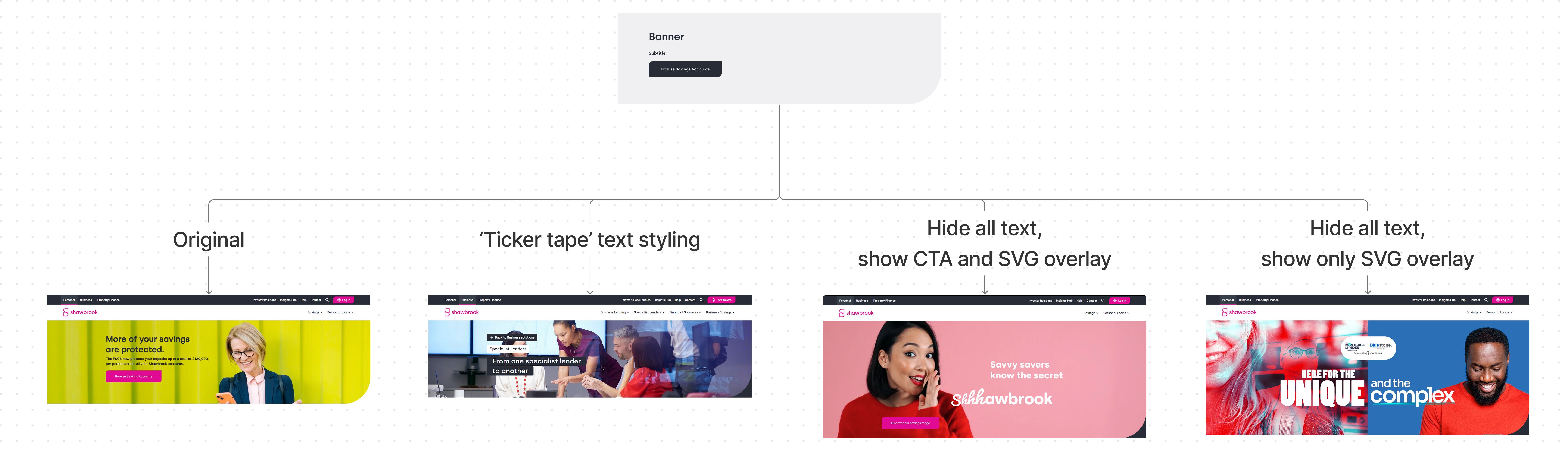
The original banner supported only a title and subtitle. With a few HTML and CSS tweaks, we extended it into multiple variants: a ticker-tape text style, a text-free version with an SVG overlay, and a full SVG-only background.